Joel
Fletcher is a character animation and visual artists for feature
films, commercials and video games. He is based in Los Angeles and
also does photography, in particular he works with anaglyphs.
Fletcher
started painting from an early age and had his goals set on becoming
a book illustrator. For a school project Fletcher worked with Super 8
film where he found his passion for animation. After his college
years Fletcher continued his painting and took up carpentering,
picture framing and being a waiter to pay his bills and cover
expenses. In 1981 Fletcher was given a grant from University of
Wisconsin Board of Regents for film making after which he moved to LA
to pursue a career in filmmaking where he managed to get work as a
model maker, prop fabricator, set builder and eventually an animator.
(Fletcher. J. 2014)
 |
| Joel Fletcher |
What
attracted me to Fletcher's work was his gallery on landscape
anaglyphs as he was one of very few I have managed to find, if not
the only. Looking through his website Fletcher has published a lot of
work utilising stereo anaglyphs, he has several galleries dedicated
to the art including landscape, nightmare, glamour, digital and movie
related.
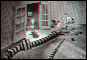
The
majority of Fletcher's anaglyphic work is in black and white while he
landscape work is in colour. Comparing the two I think the black and
white work is much more effective and illustrates the 3D illusion
much better than the colour work. There is a ghosting effect that can
occur when making anaglyphs because of over layering colours and
lines, this effect seems to appear a lot more in the colour images so
the black and white images seems to be a lot higher quality, crisper
and sharper, from other research I gathered this seems to be a
general thing between black and white and colour anaglyphs no matter
what the quality, the black and white version generally looks better.
 |
| Joel Fletcher |
When
comparing the above black and white images to the colour ones below
its easy to see the quality appears to be better with the black and
white images, perhaps this is the because of the nature of the
subject, the geometry of the subjects, or because of the previously
mentioned black and white and colour quality thing.
When
looking at the images below I think the 3D effect struggles with the
trees, in particular with trees in the background. The images with
the trees as the foreground work well, but when they start to creep
towards the background the image starts to become unclear and
blurred.
 |
| Joel Fletcher |
 |
| Joel Fletcher |
 |
| Joel Fletcher |
 |
| Joel Fletcher |
No comments:
Post a Comment